sophisticated pj masks* shared kids' bedroom (one room challenge week 2)
Welcome back to the spring edition of One Room Challenge. If you are just joining us, click here to see what this project is all about. If you are new to this website, welcome! Hope you will stick around and explore a bit. If you have no idea why you are on this blog in the first place, you are probably procrastinating something very important and should get back to work just as soon as you check out some of my favorite previous posts like this one or this one.
Last week, we laid out some preliminary floor plans that might work for two kids sharing either of the existing bedrooms. We were looking for enough space for two beds, storage for clothing, and room to grow (i.e., play). The room's future residents were looking for PJ Masks, Princesses, and blue. It didn’t take long for us to decide that C’s room made the most sense for a shared space. It is slightly larger, with a bigger open closet, and it is just off of the living room thus allowing a sleeping baby to be further from the noise factor of his/her siblings.
The real question in this shared kids’ room design came down to aesthetic versus practical.
Mom, Whitney, fell in love with everything about this room as we were pinning inspiration. So I took the image and ran with it to see how it would feel in their home.
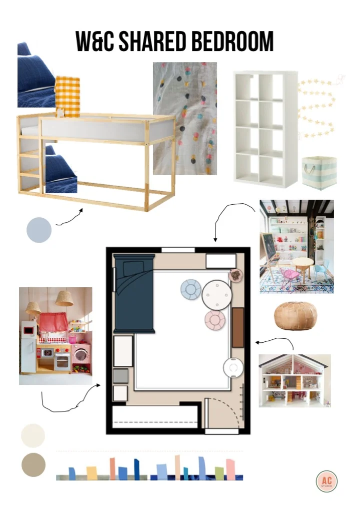
Meanwhile, I also went a completely different route with a bunkbed and brighter colors inspired by things the kids indicated that they love. (Yep, I totally sent them a design questionnaire and the answers were just as funny as you would imagine.)
Whitney loved the look of the first room but the practicality of the second, so I combined the colors from the first into the layout of the second.
Better, but there was no dresser included in the plan. So we added a dresser and swapped out the cubbies for a taller shelf that is attached to the wall. This meant eliminating the play kitchen.
Whitney wasn’t as in love with the olive green paint on the bunkbed as she was on the original twin bed inspiration. I was concerned that we would need to find a very colorful rug to pull in the navy bedding that Whitney wants to keep, olive bed, and existing khaki trim without making the room look too masculine for C. I was also concerned that such a rug would eat up most of our budget. We agreed that once the kids are older, we can attack W's room (which may or may not be shared depending on the gender of baby number 3), and include the olive green twin beds in that round.
I began a new search for inspiration using blue and khaki as my color guide.
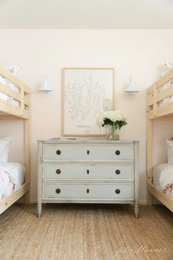
And then I stumbled on this bunk room...
That light blue dresser was the key to my happiness. Oh, I mean key to my design puzzle.
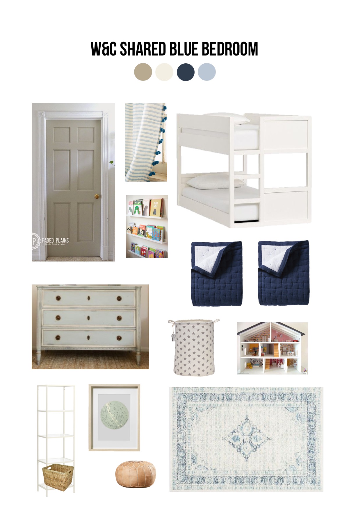
I ran these colors and a few brighter versions (that included PJ Masks and Princess art) by Whitney, who in turn, ran them by W & C. Surprisingly, both kids liked this palette best, although it's possible C was copying her brother and W insisted that the PJ Mask plush character from one of the brighter versions be included in this more subtle version of the room.
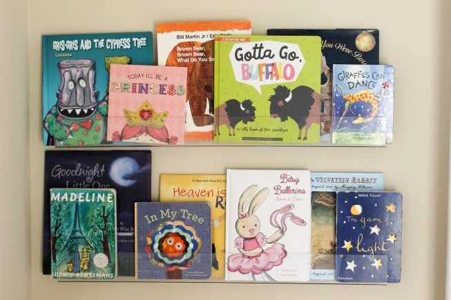
We decided that painting the walls white would help keep the room from looking drab. The trim and doors will be kept khaki (you can see what this might look like in the image above or here). We also decided to use the gold shelf that was already in C's room to reduce the overall cost of the project. Whitney plans to display W's finished lego projects here. W has a lamp that we can use for the dresser and C's bookshelves will likely hang above each bunk.
The dollhouse will stay at the foot of the bunkbed, but the kitchen will have to find a new home. TBD on that one. We will add a play table and two poufs to the center of the room for lego building and drawing. We also need a large area rug, some hooks, and a laundry basket. Oh! And we need a bunk bed and dresser. Stay tuned for next week, when we will look at area rugs, dressers, and bunks. All the big ticket items in one shot. And don't worry, we will still be adding some PJ Masks...
Until then, I hope you will check out the action on the featured designer and other guest participant blogs. You might need a larger cup of coffee for this though because there is some really good stuff. Photographer Gray Malin is doing an outdoor area. I love what Apartment 34 is doing with California Scandinavian (a style I could personally live in). Vanessa has pulled off some amazing stuff in the past, she's one to watch, also this mood board from Jest Cafe has got me curious. I always love watching Kate Smith's progress during the challenge too. Until next week...
*P.S. Huge thanks to Paige for inadvertently titling this week's post. "Sophisticated PJ Masks" has that certain ring to it, doesn't it? Paige wins.
**P.P.S. While you wait for the next "official" update, you can follow along with this project as well as our remodel and other good stuff on Instagram!
