one room challenge: the a-frame gets groovy
It’s week 2 of the One Room Challenge. If you are new here, welcome! You can catch up on the project by reading week 1.
One of the things I always ask clients when we begin working together is how they want to feel in the space we are decorating. Of course we also need to work with the existing architectural detail (and sometimes the existing colors or furniture), but the feeling the client is looking for coupled with functionality generally drive the design process.
Mood is a great place to start when decorating for yourself as well. In this case, the A-frame is where we go to let go, to live simply without schedule or agenda. We don’t want to take the place too seriously (I mean, we named the place after this John Prine song after all). We want to put a glass down without thinking about whether it will ruin the table and walk around with sand on our feet that we didn’t quite hose off. (Did I mention that the A-frame is at the beach?) We want it to be fun, easy, carefree. And to me, fun means color. Lots of it.
It is hard to overlook the retro vibe of this house. We’ve decided to work with it rather than against it. I mean, how cool is that green range? Yeah. It’s amazing. So we are going to work with the colors already in the house and the time period to which the house belongs – the seventies. This is not going to be your classic blue-beige-white beach house.
Image sources from all over the internet. Sorry, folks, I didn’t list them because I thought I would just be using this mood board for myself. But since it is totally bad form not to provide credit for other people’s work, please let me know if you would like the source and I’ll get it to you! And huge thank you to the creatives who inspired me here. (PS aren’t those paintings by Janet Hill are THE BEST?)
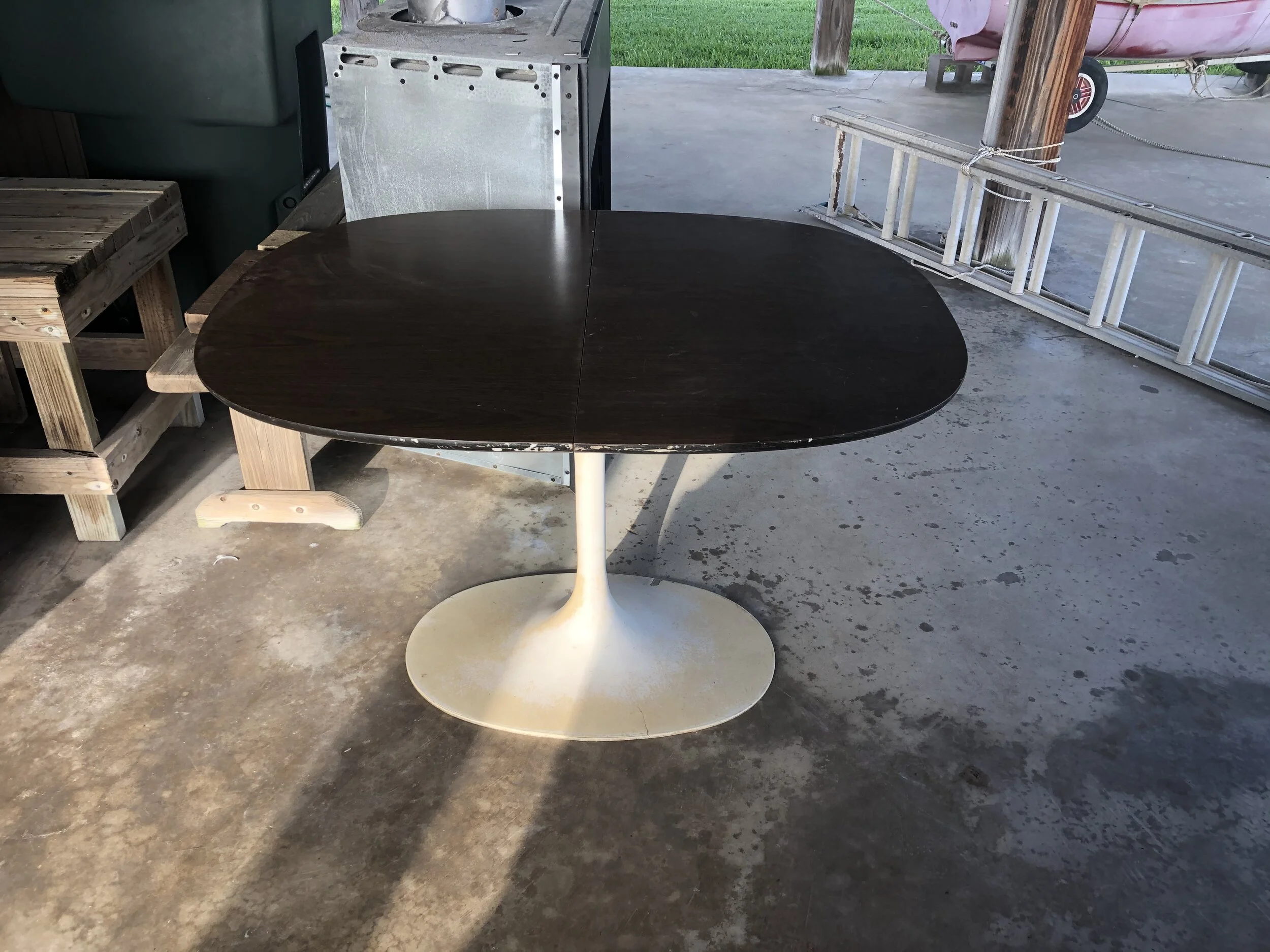
My husband’s main requests for the house were a comfortable bed (still working on that one) and a sofa long enough to nap on. He also has a pretty strict budget in mind. Needless to say, I’ve been spending a lot of time on Facebook Marketplace. I was able to find an amazing dining table there that we cleaned up and painted, as well as a rattan living room chair that I’ll be picking up on Saturday.
The FB table before patching and paint.
For a sofa that fit the nap length requirement, the vibe, and was *sort of* within budget, I went to Article. We have a couple of chairs from Article in our bedroom at home that we love and while it can be scary to buy furniture online when you haven’t had a chance to sit in it, I thought this sofa might be worth the risk. It was. We love the color and texture of the sofa. It fits perfectly in the small living room while still providing enough length for my husband to nap.
While at Article, I also ordered dining chairs for our newly updated tulip table. I loved the color options, the painted legs, and the classic shape. The polypropylene seat is perfect for easy clean up and wet beach butts.
The lovely dolphin mobile came with the house. Don’t worry. It will be relocated. So will the SNRA sign, my husband’s decorative contribution to the house.
Now obviously, the sofa isn’t going to stay in the middle of the living room and we are going to fix the hole in both the ceiling and the floor. But we have our foundations for the room: an olive green sofa, a freshened up tulip table, and orange chairs. Now we need a rug to anchor the living room, additional seating, and some art. Some might say that we also need window coverings, but with this many windows, I’m a fan of leaving the windows clean and open. I do want to change the brown paint on that wall but still haven’t decided what color to paint it. This may end up as a poll on Instagram. No kidding.
We need additional lighting since there are no lights in the main living area of the house (ok, there are two lights above the kitchen wall, neatly labeled “sunroom” by the previous owner, but they may as well be a candle once the sun goes down). This will probably entail a lamp (which requires a side table) and some type of lighting over the dining table (which requires and electrician as there are no outlets on the window wall). I would love to use this fixture over the dining table but that’s for another lifetime when we win the lottery that we don’t even play. I’ll very likely end up with an IKEA standard - stylish and affordable (I kind of like this one too).
stools, runner, flower sconce, yellow sconce, chairs, table (similar), light fixture, paint, spiral stairs.
We may also paint the kitchen cabinets (how cool is this kitchen with deep olive cabinets and lighter green counters?) but my money is on that not getting done during this round of One Room Challenge.
Next week, we will talk about spacing and layout of the room, as well as what to do with the dead space that used to be occupied by the dining table. Until then, check out the other guest participants’ progress on their projects.


