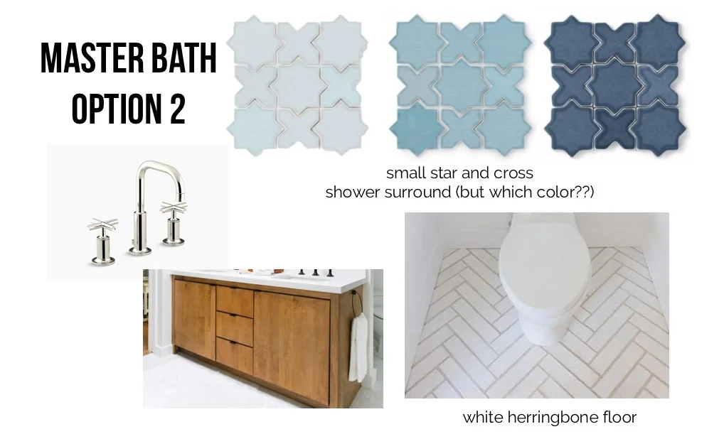
master bath tile (modern southern bungalow week 12)
I'm pretty sure Gaudí designed Park Güell because he loved all the tile and all the colors and couldn't decide which to use. Ok, perhaps there was a greater cause in that particular instance, but I'm just saying that if it was as simple as loving all the tile, I may be up for a new art project.
Tile decisions are no joke, y'all. For one thing, tile is not cheap. I mean, it can be. White subway tile definitely has price point and longevity going for it. But what if you are ready for something different? There is no shortage of amazing master bathrooms on Pinterest. You can live in those images for years without seeing the same bath twice. But there is a pattern. You'll find yourself falling into a category sooner or later and come up with your own idea of bath perfection.
And then you will talk to your spouse, who will tell you that he has very particular ideas about what kind of bath he wants, and it isn't what you are proposing.
So you go back to the drawing board with both his AND your ideas in mind. You discover that you can agree on a common hue and a common feel. You both want a retreat that feels light, but not sterile; calming, but still happy. You come up with a new mood board and you both agree it's a great place to start. You agree to brushed nickel fixtures and a natural wood vanity (although you still are considering navy blue for the vanity). You don't want to even discuss lights.
Oh, wait. Just me? You don't discuss the pros and cons of each element of your bathroom with your spouse? You don't text each other photos of various hotel bathrooms? Hmmm...
Anyway, you decide to start with tile (again), since it is the largest investment for the space and also has the biggest impact. There's one little sticking point to which you and your spouse can't seem to agree. White tile. He doesn't like it. You say, very emphatically, and perhaps not as politely as you should, that there is no way one can make a bathroom without using some form of white somewhere. Of course, you know this isn't true. You know there are some amazingly cool bathrooms with not a speck of white tile. You just hadn't intended to have one in your own house.
You back track. You offer the theory that white tile is really best if this house is ever going to be sold. You suggest that the blue tile will have more impact if there is white to balance it. You search “blue shower” and, while you see some very cool ideas, still can’t get on board with the concept as a whole.
You have to get off of the Pinterest.
This is where we need to talk. The Pinterest can be your best friend or your worst enemy. Sometimes, you really just need to get out in the world and see what is there. Go to the tile store. Trust your gut. Ask questions.
That’s exactly what I did last week, and I came up with three looks that combine my husband’s desire to stay away from white subway tile and my desire to keep white in the palette. Mind you, I did not stay away from white tile completely. And the jury is still out on whether any of these will meet the Mister's Muster if you know what I mean. But the clock is ticking so I had to go with something.
The first option arose out of my interest in keeping the bathroom budget friendly:
Sources: faucet, vanity (designed by Orlando Soria), blue tile, 4" hex tile, closet floor.
I found inexpensive light blue tile in a large format that I figured could be laid in a herringbone pattern (like this). Rather than white subway tile, I was inspired by this image to look at hex tile for shower wall. But that was still a white shower. What about the blue shower that my husband was looking for?
Sources: faucet, vanity (designed by Orlando Soria), blue tile, floor pattern.
Flipping the floor to white (also easy to find in either 3"x12" or 4"x12"), and sticking with the herringbone pattern, I moved to a tile shape that I was considering (in white, of course) for the kitchen, but which could play well in the shower instead. This mini star and cross pattern is classic but also feels interesting and is available in about a million colors.
Let's talk for just a minute about price. Thirty-five dollars a square foot?! For tile??? Are you serious?!? I looked everywhere for a less expensive version of this, really, I did. But I got stuck. There was nothing that was quite as cool as this tile. And of course, while I was looking, I found that I really liked the larger version of the star and cross that Chelsey Foy used in her master bathroom. Really liked doesn't begin to cut it. Loved is more appropriate. And, believe it or not, my husband loved it too.
Sources: faucet, vanity (designed by Orlando Soria), white 4" x 12" tile, blue tile, closet floor.
So what I really need right now is a sponsorship by Fireclay Tile. Are you hearing me out there sponsorship people? I know I don't have the following of Emily Henderson, but a break would be awesome here. Honestly, though, Fireclay does provide a price break for large quantities, which is awesome, and I'm a huge fan of their sustainable business practices. So I'm still trying to figure out how I can get some less expensive tile in combination with some of this fantastic tile and make it all work. Suggestions? Opinions? Votes on tile outcome? I'm listening...


